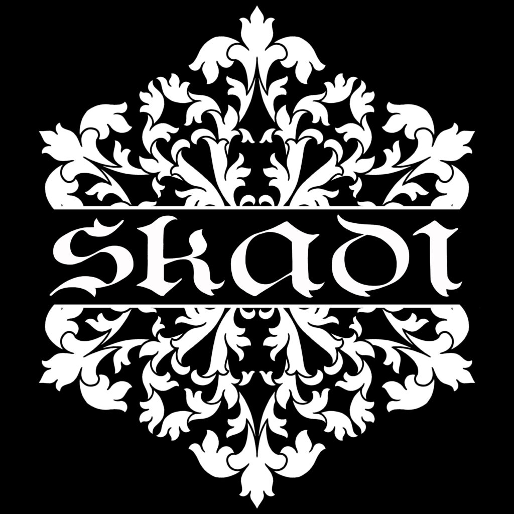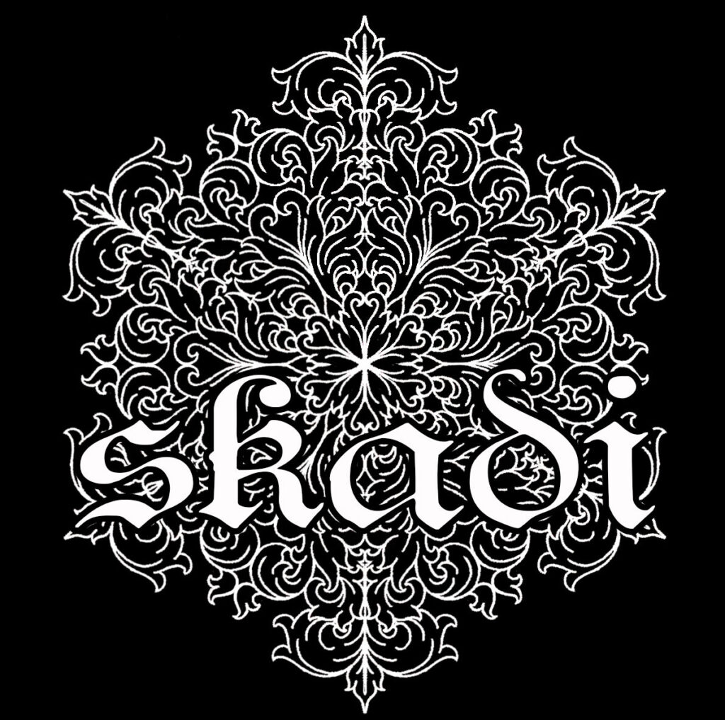
New logo
The keen of eye may have noticed I just snuck in a new logo.
The main issue with the old Skadi logo was that due to the ornate detail it looked great on a large tote bag but not so legible as a tiny thumbnail on Instagram. The problem I face with creating a new logo is that I don’t want to have to just throw away all the business cards, packaging and signage that has the old logo. So for more of a gradual transition I decided to just revamp the old logo. All the elements are there; the ornate snowflake, the name, the high contrast monochrome versatility, they’re all just a bit cleaner and easier to read at different sizes.
I figure plenty of people won’t even notice, I just wrote this little message for those of you who are sure something is different but you can’t quite put your finger on it. You’re not losing it 😉


